
Born of a conversation with friends, the accidentally-coined band name, Dollhouse Arsonists, sparked an idea for a 2000’s revival punk rock band visual package.
Inspired by bands such as Paramore, Sum 41, Fall Out Boy, My Chemical Romance and a dash of Pussy Riot, I created branding and merchandise for a new-on-the-scene EP album that pays homage to early 2000’s punk and packs a punch. This is my take on a band whose name infers the aggression emblematic of punk and indie rock culture, with a softened edge; playground pyromania—potentially dangerous, a little dramatic, and sure to be called “racket” when blasted through speakers in your parents’ garage.

I began the visual identity for the album with the color color palette. Black, of course, as the main focus, brightened by pops of the classic punk purple and a fiery orange-red and magenta.
The typography formed after some play with fonts and letters–I settled on a ransom-note style cutouts for the band name and Bad Typ, a mix-case font irreverent for the title. Bad Typ mimics both the randomized size of collaged letters, and the refusal to follow rules inherent to the punk genre. A default Myriad Pro for standard copy rounds out the low-budget brand with what comes pre-loaded on computer software.

Like any good band starting out in their mom’s basement, the band logo evolved from playing with cheap, accessible materials; a grainy photocopies of letters cut out of magazines and pasted onto black paper–dried glue smudges and all.

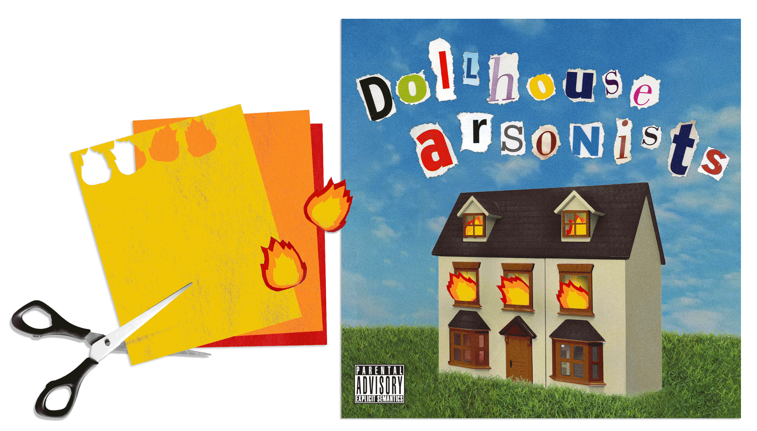
Inspiration for the other album visuals came from the unique feel of many early 2000’s pop punk, indie, and punk albums. Hearkening back to the early days of Photoshop 1.0, punk graphics tended to be rough collages; layered, filtered, and partially hand-drawn. Many included textural elements of fibers or paint interwoven with photographs and blocky san-serif fonts.
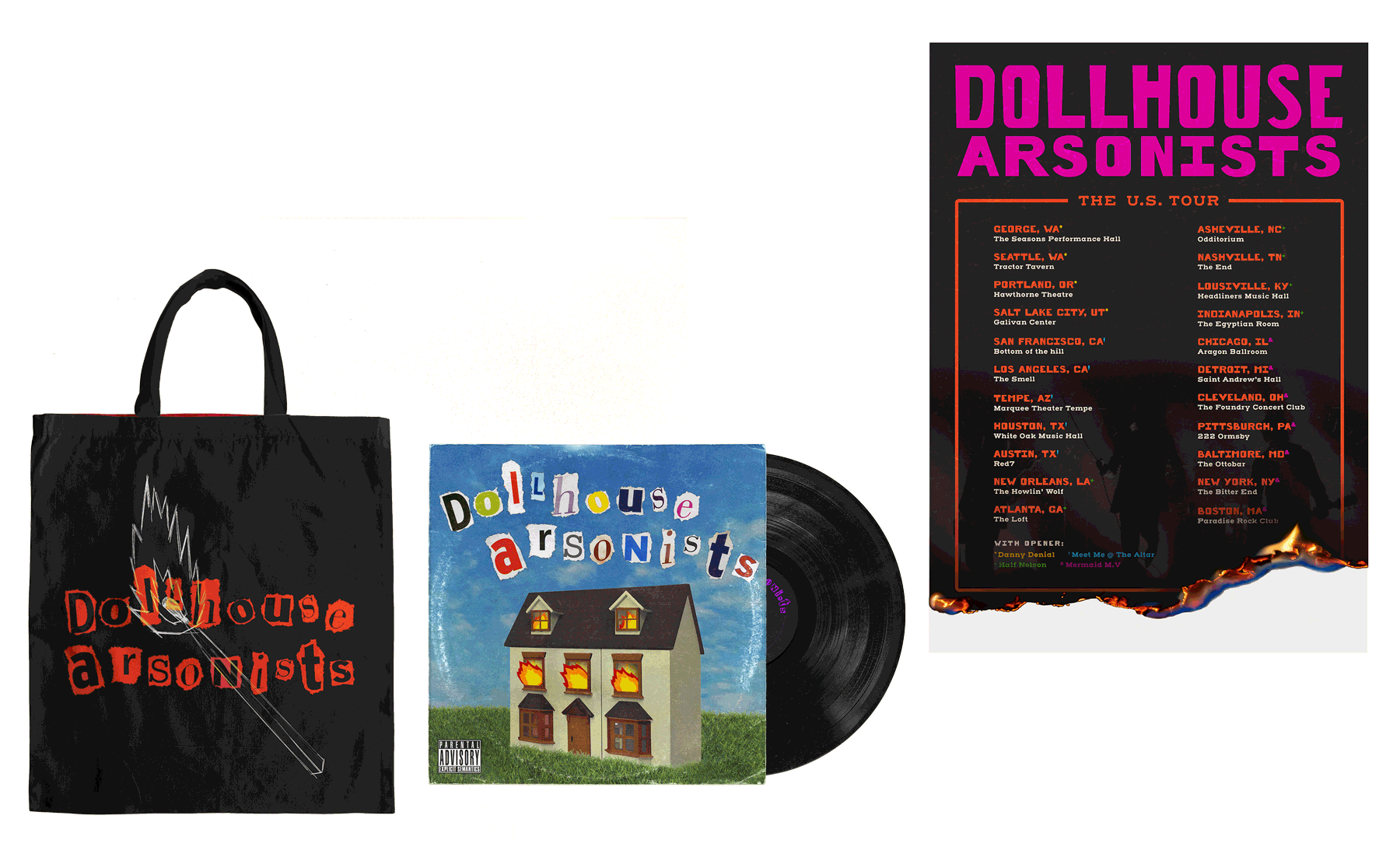
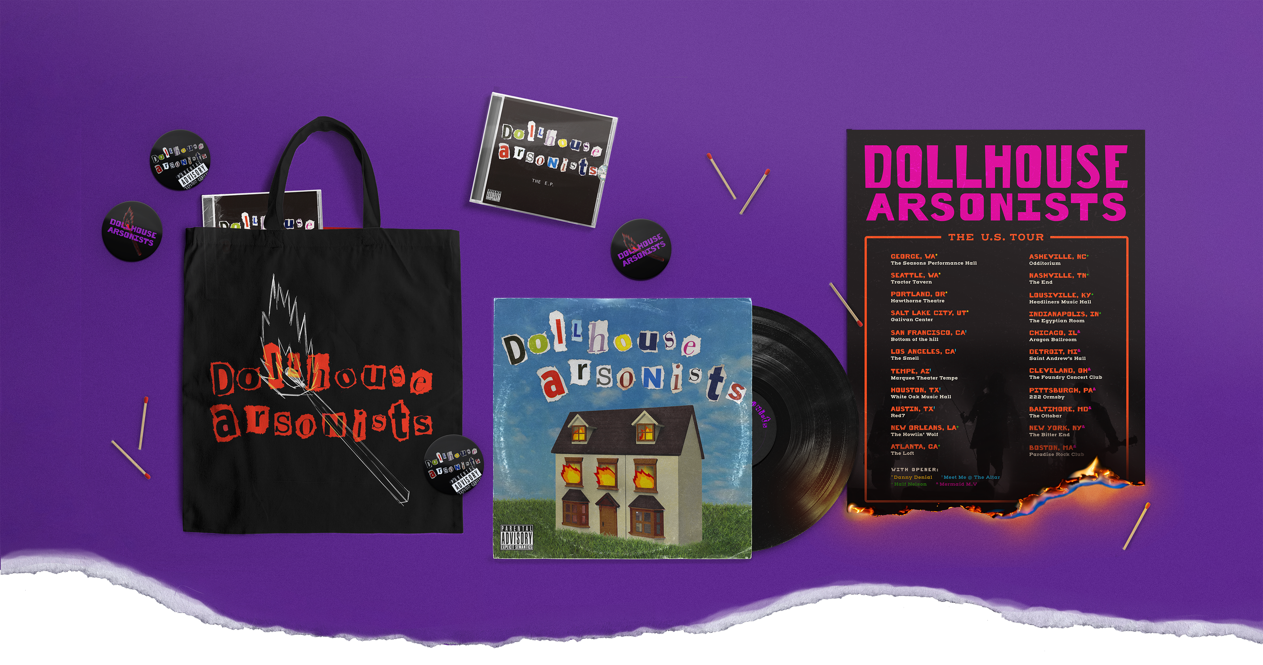
Fom here, the rest of the brand development followed. I designed a vinyl sleeve, CD design including a case with front and back and lyric booklet, and various types of merchandise you’d find at the merch table in the back of a dimly lit, concrete-floored music venue.

In development of the other merchandise, I leaned into the hand-drawn and collage aspects of my inspiration. I utilized wood cut textures for a lit match motif repeated over the tote bag and sticker designs, layered with a screen-printed style variation of the collaged logo. For the vinyl sleeve, I executed a collage containing both digital and tactile textures; an airbrushed dollhouse with felt fire escaping from the windows.

The lyric book alongside the CD contained more realistic images of a dollhouse on fire; photoshopped images of miniature rooms ablaze, and, on the back, the lit-match motif reappearing with a porcelain doll caught red-handed in the act of dollhouse arson.
The tour poster—a collection of real basement venues scattered across small-town America with niche punk and indie openers—features a faux flame effect, engulfing the bottom of the poster.
A screen-printed tote bag showcases the band’s title treatment as a monochrome print, overlaid with a sketched match set ablaze.
Dollhouse Arsonists are the next big thing in indue punk revival, and you have a front row seat to their bespoke branding.